DSR
What is the DSR?

DSR stands for Demand to Supply Ratio. The DSR is a score out of 100 for the ratio of demand
to supply for a property market. The higher the DSR,
the more demand exceeds supply.
One of the most fundamental laws of economics is that prices
rise when demand exceeds supply.
If we can gauge supply and we can gauge demand,
then we can gauge the pressure on prices to rise. In other words we can predict capital growth.
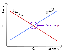
To gauge demand relative to supply the DSR examines numerous supply and demand indicators like:
- Auction clearance rates
- Days on market
- Stock on market
- Vacancy rates
- and plenty more
Does the DSR really work?
Yes the DSR definitely does work. In fact, there are several pages on this site with irrefutable
evidence that the DSR works.
These pages mention resources you can use to verify the performance results.
Markets with a high DSR can be expected to outperform markets with a low DSR as the following
chart shows.
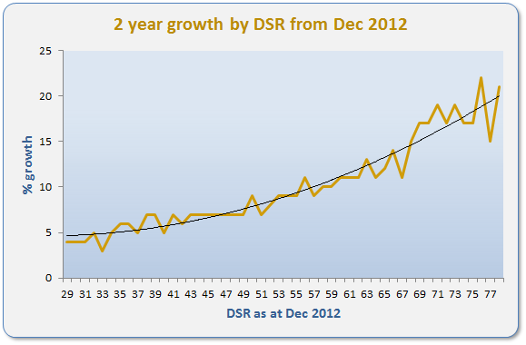
In the bottom left you can see the average two year capital growth
for markets with a DSR of 30 was about 4%. A DSR of 30 out of 100 is
considered "poor".
Markets with a DSR over 67 (top right) more than quadrupled the performance of the "poor" DSR markets.
The chart shows a very clear relationship between a high DSR and high capital growth in the immediate
future (2 years in this case).
DSR+
Despite how well the DSR has worked over the years, it is recommended that you
use the DSR+ if you're planning on investing hundreds
of thousands of dollars. DSR+ is version 2 of the Demand to Supply Ratio. It is a more advanced algorithm. The DSR+ outperforms
the basic DSR as shown below.
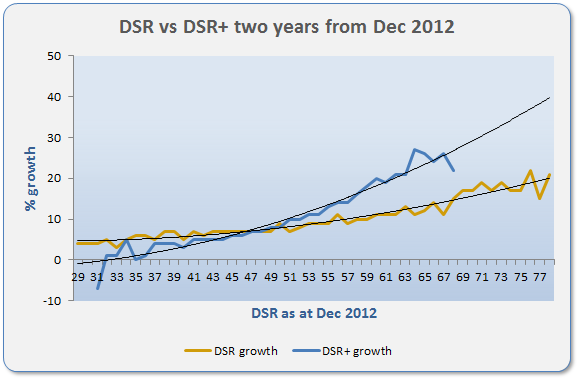
The chart shows the relationship to capital growth is even clearer with
DSR+ than with DSR.
The DSR+ includes more than double the statistics of the basic DSR.
And more are added each year, improving its reliability
at picking growth markets.
Poor markets are more clearly identified by the DSR+ because of
the larger number of stats used in its calculation. The DSR+ also finds good markets more accurately.
Note that the upper and lower ranges of the curves show greater volatility. This is because there are
fewer markets in the sample. These types of markets are abnormal and therefore uncommon.
The DSR+ used in the above chart was in its infancy in Dec 2012. More goes into the calculation of
the DSR+ now days. So you can expect the accuracy to be even greater.
Note that the DSR+ is not available to all members.
See pricing for details.
Are high DSR markets too hot?
One of the most frequent complaints heard about the DSR is that it identifies markets that are "already hot" or
that are "too hot".
The term "hot" is a cliché. It is therefore not possible to precisely argue for or against these claims.
Simply, a high DSR market is one in which demand exceeds supply. If that is termed "hot",
then yes the DSR identifies
markets that are "already hot". This is preferred to buying in "cold" markets, where supply
exceeds demand, or in markets where supply and demand are unknown.
The term "too hot" implies there is a point when demand exceeds supply to such an extent that the fundamental
laws of economics suddenly invert. This is of course nonsense.
However, investors will find it very difficult to buy in a market with a very high DSR.
Multi-million dollar portfolios do require hard work, contrary to what many investment educators claim.
The alternative is to buy into a market with a low DSR. These are very easy to buy into. Property is cheap and
there are loads on offer. The problem is you may not experience capital growth for many years.
If you 're ever worried about buying at the top of a market cycle, where prices may have reached their peak,
check the MCT or LTG. Excessive recent growth may indicate there is
not as much growth still to come before demand is subdued. These stats are considered in
the DSR+.
Is the DSR reliable?
Yes. The DSR uses a number of statistics to draw its conclusion. The DSR algorithm isolates each statistic
so that a single
anomaly in any one statistic can't spill over to significantly affect the overall DSR score.
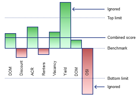
Also, each statistic considered by the DSR is given a reasonable limit.
A yield of 9% for example may get the top score for yield. But a yield of
19% will get the same score. So a crazy yield (an anomalous one) won't distort the DSR any more than a very good yield.
Complicated calculations on meta-data are performed to evaluate
the statistical reliability of the DSR ensuring it doesn't mislead investors. Up to nine different considerations are applied to each
datum to gauge its reliability.
However, there will always be a dependency on the accuracy of the
original source which at some stage must be assumed.
Where data is considered unrealistic, it is filtered as best as possible
from the DSR database.
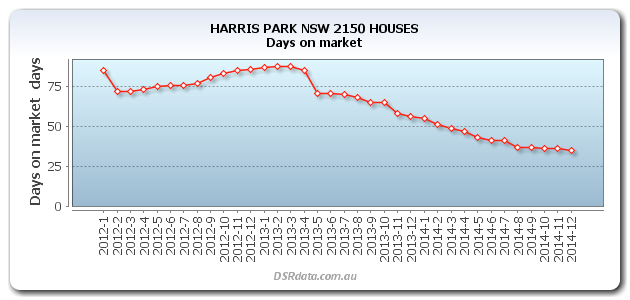
Some data can be quite volatile, jumping up and down each month.
It is recommended you examine an
historical chart to get a better idea of the long term value rather than an
isolated month. The following chart has low volatility, the month to month change is usually small and consistent.
This means the most recent month's figure is more reliable.
Now imagine a market that has only a few rental properties and then one becomes available.
The vacancy rate will jump up dramatically. And as soon as that vacant property is tenanted, the vacancy drops suddenly again.
Markets like these with low transaction volumes will show volatile charts like the one following.
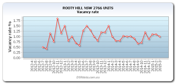
Always check the chart to place the statistic in historical context.
Be sure to check the
statistical reliability
figure too.
And to be doubly-sure, check other providers' figures and ask local real estate agents and investors for confirmation.
For a more accurate gauge of the demand to supply and for extra stats
examining the market from even more angles, check out the stats of
the DSR+.
What is a good DSR score?
If a suburb has a DSR of 50 out of 100, it means that supply and demand are in
balance. The majority
of property markets for 2014 had a DSR between 50 and 60.
These markets are likely to grow at the same rate as the long term national
average.
Less than 0.5% of property markets are likely to have a DSR above 75. These
markets are highly desired.
Council is tight and current owners won't budge. Expect growth in
these markets to exceed the national average
growth rate for the next year at least.
The DSR for the very top market can sometimes be as high as 90. The following
graphic places the
DSR for Houses in Harris Park NSW in context with the rest of the country's
DSR scores.

The chart shows that for Dec 2014 the maximum DSR was 87 country-wide and the minimum was 20.
Anywhere above 60 is better than most.
This chart is called a "context ruler" because it places a statistic in context along a ruler.
You can get a full understanding of how to read the
context ruler here.
Some of the worst property markets to invest in have DSR scores in the low twenties.
These are locations of adverse economic conditions or crazy developer oversupply.
These markets should be avoided if you're looking for strong capital growth in the next couple of years.
If you find a market that is close to the mark, but you're not sure, you can take the research a
step further and check the DSR+.
You can see DSR values for markets around
Australia here.
Why is the DSR such a big deal?
The DSR is important for these reasons:
- It gauges growth potential. As shown in the prior graph, there is a striking correlation between the DSR and imminent price growth.
- It is objective.The DSR has no bias for a suburb in which a developer or real estate agent is promoting their stock, or for a suburb in which an investor used to live. The DSR is completely objective because it is calculated by a computer without fear or optimism.
- It is consistent. The same algorithm is applied for all markets meaning you can compare apples against apples.
- It is numerical. Nobody knows if a new bridge over the river will impact property prices more so than a new private school. But everybody knows that 2.2% vacancy is better than 3.6% vacancy. And we know by how much too.
- It is simple. It is easy to gauge growth potential viewing a number between 0 and 100.
- It is country-wide. It is impossible to manually examine every property market in all of the nearly 16,000 localities Australia-wide. The DSR crunches the numbers for you.
How can I use the DSR?
The DSR can be used as a quick look-up mechanism for checking the health of property markets.
- A financial advisor suggests you buy into a certain market. Check the DSR.
- You're wondering if now is a good time to enter a market you've had your eye on. Check.
- A developer argues their stock is in a top growth location. Check the DSR and MCT.
- You're wondering if you should sell a property because you're hearing bad news. Check the DSR.
- A real estate agent says a certain market is set to boom. Check the DSR.
- You're wondering if now is a good time to refinance because you suspect the market has peaked. Check the DSR and MCT
- A property expert/guru is claiming a certain market is hot. Check the DSR.
To dig deeper with your short list, you can also check the statistics involved in the DSR+.
What goes into the DSR?
The DSR considers eight important statistics in its calculation of
the potential for capital growth. These include:
- Days on market (DOM)
- Vendor discount
- Auction Clearance Rate (ACR)
- Proportion of renters to owner occupiers
- Vacancy rate
- Yield
- Stock on market percentage (SOM%)
- Online search interest (OSI)
Although eight statistics are actually more than many property investors examine before buying, the DSR is not nearly enough to guarantee exceptional capital growth. The DSR is just a quick figure to gauge the ball-park health of a property market. A far more comprehensive statistic is the DSR+.
How is the DSR built?
The DSR measures demand and compares it to a measurement for supply to see the potential for
immediate capital growth. The DSR is derived from a number of other statistics giving an
overall summary of the health of a market.
The concept of using supply and demand to gauge future price growth is simple.
The tricky part is the process required to come up with a score for it:
- Acquire the appropriate base data.
- Determine its statistical reliability.
- Filter out the rubbish.
- Derive statistics from the base data.
- Combine multiple data sources intelligently for greater accuracy.
- Calibrate each statistic's worth towards overall capital growth potential.
- Combine statistics according to their worth.
- Calculate the final figure.
How is each stat calibrated?
Obviously some stats are more important to determining capital growth potential than others.
Each stat that contributes to the overall DSR is combined using an importance rating.
There's a fine line between being transparent and giving away intellectual property.
So, how each stat is calibrated must remain a secret. It needs to be made a little tougher
for wanna be competitors to replicate this work.
However, what can be disclosed is how not to calibrate the stats. Any statistician or
scoring expert would go
about the task of creating a scoring algorithm in the same predictable but flawed manner:
Examine the highest capital growth markets of the past to see what
statistics they had in common, prior
to their rapid rise.
This "reverse engineering" approach is flawed because the means
by which capital growth is calculated is flawed. Every stat can be subject to
anomalies in the base data, including capital growth calculations.
Those markets found to have the highest growth are invariably those markets where there is an
anomaly in the base data.
You can see these "top performing suburbs" sometimes in property magazines and other
websites. They go something like this:
Top capital growth markets for the last 12 months in QLD:
| Suburb | Value | 12 mth growth |
|---|---|---|
| Somewhereville heights | $240,000 | 43% |
| Nextown | $550,000 | 41% |
| Nowhere North | $180,000 | 39% |
| Andso-on | $465,000 | 38% |
Some enterprises may even offer a free report of this sort of rubbish. Valued at $487, but free if you give them your email address. Their plan is not to advertise their incompetency, but to acquire the less thoughtful kind of investor.
Base data sources
Some sources for this kind of data include: