How to gauge suburb investment potential - Suburb Analyser
Intro
Hi. It's Jeremy Sheppard here, of DSR Data.
I can't count the number of times someone has asked me for my opinion about a suburb's investment potential. "Is Springfield good"? "Is Kingswood OK"? "What do you think about Black Creek"?
My immediate response is,
What's the DSR?
It all comes down to supply and demand. You've probably heard that before a number of times from a number of property investment experts.
A good investment location will have high demand relative to supply. The Demand to Supply Ratio (or DSR) is the fastest way to size up a suburb's potential.
Quick DSR check
You can use the DSR to get a ball-park estimate of supply and demand within 30 seconds without even a login. The home page at DSRdata.com.au contains a widget called the DSR meter.
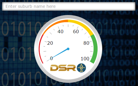
Start typing to get a list of matches. Then select the market of interest: house/unit.
Below the DSR meter a box will appear...
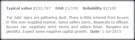
The box contains:
The typical value of properties in this market which is like the median but more accurate
The DSR again as a fraction out of 100
The reliability of the DSR, statistically speaking which is again out of 100
A paragraph of symptoms you might witness in a property market like this
The date the information is relevant for
Does the DSR really work?
You may have subscribed to DSR Data for a second opinion on vacancy rates. Or you may have interest in novel indicators like:
The complete list is here
That's fine. It's great to see members getting use of the data in every way possible. But the heart of DSRdata.com.au is the DSR.
The DSR wraps all the opinions each statistic is hinting at into a single overall figure of demand versus supply.


The DSR gauges supply and demand and therefore predicts capital growth. It really does work. You can see the evidence on this page...
It's a big read, but hey, there's a lot of evidence. The cost of thorough research is more often time rather than money. DSR Data speeds that research up. But firstly you need to trust the data. This is why DSR Data's past performance is an open book.
But there's no point in us being transparent if you're not prepared to have a look. If you don't consider the evidence, then you forfeit your right to be a sceptic of the DSR.
Following is just one of the numerous charts showing how the DSR (red line) has outperformed the industry experts (blue line) and how those industry experts outperformed the national average (green line).
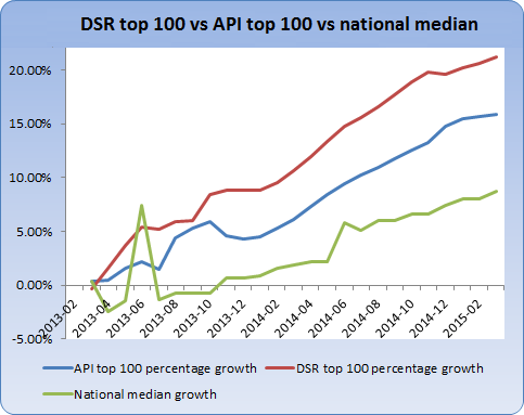
And this is just the DSR, not the DSR+. And it's the DSR top 100, not the top 10 which is even better. And no fundamental research was applied to further refine the list. In other words, you should be able to outperform the top line.
If you can find more thoroughly researched evidence to refute the DSR or support an alternate indicator, please let me know. After all, I'm a property investor too - I'd rather be wrong and rich, than right and poor.
Using the DSR meter
The DSR meter comes in so handy. I use it to put developers in their place. They often bang on about their project being in a "high growth" location, but so few of them really are.
The DSR is also a great way of vetting a property expert. Many so-called experts mouth off about high growth locations for one reason or another, supposedly inferring their expertise. But the DSR is quite ordinary for many of these locations which can immediately highlight the volume of expert hot air you're inhaling.
The DSR meter is a great safety net for investors. It's free and fast, so there is no excuse for not checking it. That's why it's front and centre on the home page for quick access without even a login.
BTW if you have your own website, you can get the DSR meter on it, and for free. You could save someone from making a horrible mistake too. If you're interested, use the green 'Help' button at the bottom right and get in touch.
Here's how I interpret a DSR meter reading:
Less than 50 means "thumbs down"

Greater than 70 equals "thumbs up"

Anything in between means, "maybe ? but more analysis is required"

Although a DSR of 50 isn't "bad", there are so many great suburbs that are easy to find, that I usually look elsewhere if I see anything less than above average. And that's even if the intended strategy was not capital growth but perhaps: instant equity, a reno flip, development or subdivision.
Unfortunately, most markets lie in that "maybe" range. The following graphic is a context ruler showing the DSR in December 2014 for Harris Park Houses. Don't worry about understanding all of it just yet.
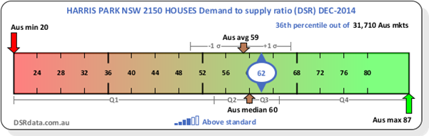
It's a bit "busy" isn't it? If you want, you can go to this explanation page: How to read a context ruler. For now, have a closer look at this part...
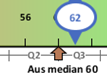
This shows that the median DSR country-wide for this month was 60 out of 100. But more to the point, it shows that half of all Australian property markets had a DSR between 53 and 65. That's all the markets within the 2nd and 3rd quartiles. These are marked as Q2 and Q3 under the ruler.
That is a very narrow range considering the minimum for the same period was 20 and the maximum was 87.
And the next graphic shows that the average DSR country-wide was 59.
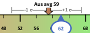
The shaded grey lines show that few property markets had a DSR less than 49 or greater than 67.
What this all means is that the vast majority of property markets across Australia are ordinary investment opportunities.
Most markets are in balance. That is, supply and demand are pretty much in-line and it is business as usual.
But as an investor I want a market in which demand exceeds supply. I want an extraordinary market, not an ordinary one.
With so many markets in this "maybe" range, I frequently have to dig a little deeper to know if a market is worth investing in. So the next step is to use the Suburb Analyser.
Using the Suburb Analyser
The Suburb Analyser is only available to paying members. After logging in, the Suburb Analyser is the 1st page you'll see.
You can get a detailed explanation of the Suburb Analyser here...
For now, the main points are that the data is grouped into 3 sections or tabs:
DSR
DSR+
SSI
Click on each tab to see the different indicators in each group. Note that the DSR+ and SSI tabs have indicators only available to privileged members. If you're not currently on a privileged membership, you'll see an error message when you try to access these tabs.
In each tab there is a table of data and buttons for each indicator to view both Context Rulers and Historical Charts. I'll go over how to use these graphics soon. But 1st we need to talk property investment tactics.
Strategy
Analysis of the data shown in the Suburb Analyser depends heavily on your investment strategy. For example, if I'm tight on surplus cash, then I'll place much more importance on yield and vacancy.
But if I'm looking to renovate and sell, then much more importance should be given to days on market (DOM) so I can sell quickly. If I'm planning to sell by auction, then I'll give more weighting to the auction clearance rate (ACR).
You get the idea - depending on your strategy, some statistics are more important than others.
It can get a bit messy combining stats for the best overall market. For example, what if stock on market is quite high (which is a bad thing) but vacancy rates are quite low (which is a good thing). How do I know if the market is OK to invest in overall?
So at DSR Data we created something to help called the Strategy Suitability Indices...
Strategy Suitability Indexes (SSI)
The SSI stats are scores out of 100 for the suitability of a market to a specific strategy. For example, if my heart is set on buying at a discount, then I would check the SSI for discounts. For more details see Strategy Suitability Indexes (SSI). Note that the SSI stats are only available to privileged members. See the pricing page for a list of memberships and what privileges they come with.
The list of SSIs include:
Renovate and sell (aka reno flip)
High cash flow
Buy and hold
Buy at discount
Develop
Low risk
Buy off plan
These indexes score the suitability of the property market to a specific strategy. A high cash-flow strategy for example will apply much more importance to yield and vacancy than other statistics.
If you are not a paying member, then you will not have access to any statistics. And if you are not a privileged member, then you may not have access to the SSI statistics. But you can still use the same concept. You can focus your attention on statistics of more importance to your strategy. You'll simply have to perform your own calculations and comparisons instead of having the SSI do it for you.
For example, if cash-flow is close to crisis, you'd choose SSI-cash flow. You'll notice on that page the following statistics are favoured more highly than others:
Yield
Vacancy
Proportion of renters
Percentage rental growth
DSR+
The 1st three stats are available to all paying members and the last two require privileged membership. So ignore the last 2 if you're not a privileged member and go to the Suburb Analyser and check the values for the other 3.
In the Suburb Analyser enter the name of your suburb and pick houses or units. Browse down the list of statistics and their values.
Then have a look at the Context Ruler for each statistic. Click on the context ruler button to the right of the statistic's value.
See if the figure is well above average compared to the rest of the Australian property market. Following is an example of the yield for Dharruk houses in June 2015.
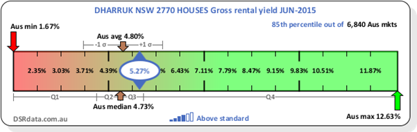
You can see in the context ruler that the yield for Dharruk houses in June 2015 was 5.27%. This was comfortably above the average for the whole country at that time. The average yield for Australia was 4.80%. The median was 4.73%.
So Dharruk houses are better than average. However, it's not one of the best markets for yield. In fact, the best market was all the way up at 12.63% for that month.
If you're unfamiliar with usual values for a statistic, the context ruler is indispensable. For example, most people know that an Auction Clearance rate of 80% is pretty good. But how many know if an SOM% of 2% is good or bad? The context ruler will tell you.
You can learn how to read a context ruler on this page...
The point of the context ruler is to see if a statistic is good, bad or normal and by how much. If you find a market in which most statistics are good, then you may be onto a winner.
Historical charts
For any of the statistics that are crucial to my requirements, I'll also have a look at the historical chart for that statistic. The history of a statistic is especially important for volatile statistics. A volatile statistic is one that is up one month and down the next.
By looking at the historical chart you can see if the statistic is unusually high or low for this month only. You can also cast your eye over the chart to estimate a line of best fit. This helps identify a more reliable ?usual? figure for that stat.
You may not have to check the historical chart for every statistic. But the more dependent you are on a particular indicator, the wiser it would be to check for volatility using the historical chart.
Summing up statistical research
If the key statistics are all above average and by comfortable margins, I know that the property market under analysis is good for my circumstances.
And if the indicators aren?t too volatile or if their extreme ranges are acceptable, then I know I have a good suburb.
The key stat is the DSR or DSR+. It has to be at least within the maybe range but preferably above it.
One more thing - I may be looking for a house instead of a unit. But I'll often check the same stats for the other property type as well. If both are good, then it lends even more weight to the argument that this is a good suburb.
Further research
At this point your analysis of the data is pretty much complete. This might take 20 minutes for a newbie especially if you're examining indicators you've never heard of before like the Ripple Effect Potential (REP).
As you do analyse more often you'll get it down to about 5 minutes. And as you develop trust for the DSR and DSR+ you can get it down to under a minute.
From here you should then go on to more fundamental research. That's assuming the statistics pointed in the right direction.
Because this is a tutorial on using the Suburb Analyser, I'll just briefly touch on the topic of fundamental research...
Fundamental research
My first stop after statistical research would be the council website. I look for development activity that might add to the supply and ruin the market.
You can also see if the council have any projects in the pipeline that might diminish demand. Things like opening a new tip in the area or an industrial zone for example, would reduce demand.
After the council website, see if the state government is planning anything. You can also check federal government websites for similar projects.
Then if you really want to dot all the i's and cross all the t's, check out private spending. This might include research on what well-known companies are doing nearby. Search for household names like:
CBA
Gloria Jeans
Bunnings
KFC
and so on
You can also look for fresh activity amongst common industries and trades like:
Electricians
Accountants
Doctors
Solicitors
Hair dressers
Restaurants
Day-care centres
and so on
This tutorial is not designed to be a complete instruction on how to research a property market. So I?ll have to leave the fundamental research there. The point is statistical research needs to be followed up with more manual or ?fundamental? research.
Next tutorial - a better way to find the best market for you
Remember that all this analysis started because you had an interest in a market. Perhaps someone suggested you check out suburb "Xyz". It may have been some advertising you saw or a blog you read or a magazine article, an industry expert recommendation or some other contact.
I don't like to spend too much time analysing markets that have been suggested to me. Instead, I'd prefer to save time and seek out the best markets for me right from the get-go.
Rather than analyse market after market to see if any fit your criteria, why not analyse all markets in the country in seconds to find the best for you? How do you find suburbs that are just what you're looking for?
This is where the Market Matcher comes in. In my opinion, the Market Matcher is the greatest tool property investors have to find the best property markets in Australia.
Really, all investors should start their research with the Market Matcher. If you want to learn how to use the Market Matcher, have a look at the next tutorial...
How to find the best suburbs that suit your criteria