Context Rulers
What is a Context Ruler?
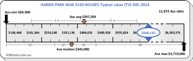
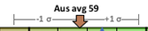
An example of a context ruler is shown below:
A context ruler places a statistic for a specific property market in context by showing where the stat sits along a ruler of all possible values for that stat.
What do all the bits mean?
Busy graphic isn't it. But once you understand each item, you can absorb a lot of information in a flash. Each component of the context ruler will be explained in detail in the following sections. Refer to the following chart.
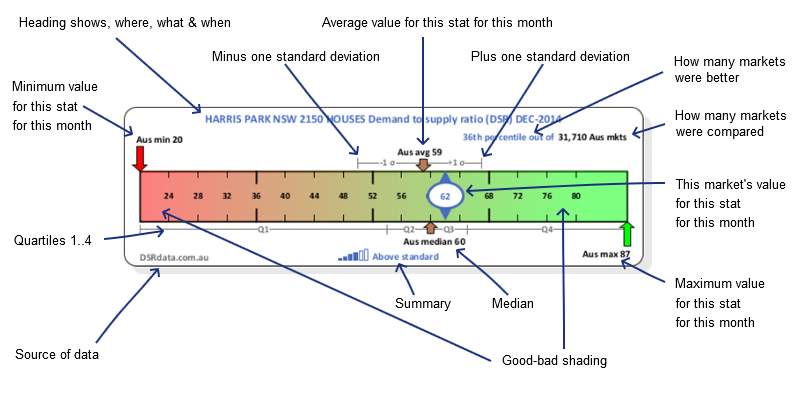
Heading
The heading is at the top and looks like this?

The heading defines the where, what and when:
- Where: a suburb, state and post code e.g. PARRAMATTA NSW 2150
- What: the property type (Houses/Units) and a statistic e.g. Vacancy rate
- When: Data available as at the end of December 2014 for example
Min and Max
The ruler shows the entire range of values a statistic had across the entire country for the month mentioned in the heading. The left of the ruler shows the minimum value and the right shows, the maximum.
Average and standard deviation
The top middle of the ruler is usually where the average sits.
The brown arrow on the top edge of the ruler points down to the place on the ruler where the average was for the statistic for all property markets for the year and month.
If your suburb of interest has a value better than the average for most stats, then you know you have a better than average property market for capital growth.
The grey lines to the left and right of the average are the minus one and plus one standard deviation points. The lower case Greek sigma character is used by statisticians to represent the standard deviation.
The standard deviation is a measure of how much variance there was in the figures across the entire Australian market. If the grey lines are short, it means most property markets had a score close to the average for this stat. The wider the range, the more unique each property market?s value for this statistic is, the more wildly they vary.
Median and Quartiles
The median and quartiles are shown along the bottom edge of the ruler.

The median is the middle figure in a set when ordered. The upward pointing brown arrow shows the place along the ruler where the median value lies.
"Q1" is the range of values within the first quartile. The lowest 25% of all markets by this stat lie in this range. "Q2" is where the 2nd 25% of all markets lie. The junction between Q2 and Q3 is always the median since 50% of all markets lie above and below this value. "Q3" is where the 3rd 25% of all markets lie and "Q4" is where the last 25% lie.
If Q2 and Q3 are close to the median, it means that most market had a figure for this stat that was close to the median. Like the standard deviation, if Q2 and Q3 are wide, it means the stats varied significantly for more markets.
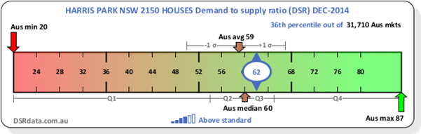
Percentile and count
The percentile and number of property markets considered in creating the context ruler appear in the top right.

The black section shows the total count of markets for the month that had a value for this stat. This tells you how many markets there are that your market is competing against.
If there are 30,000 property markets, then the 1st 300 are in the top 1 percent. This is called the "1st percentile". All property markets across the country are compared to see what percentile they fit in.
For the example above, the 36th percentile means that this statistic for the market was better than most of the other suburbs around the country. 64% of all property markets had a worse value for this statistic.
Ideally, you want your property market of interest to be in the 1st percentile.
This market's statistic value
A blue circled marker is used to point out where the statistic for the property market under examination lies along the ruler. Inside the blue circle is a number for the value of this statistic for the market appearing in the heading.

Ideally, you want this blue market to be in the green section.
Shading
You'll notice that the context ruler is shaded from red to green. Red represents "bad" and green, "good". Somewhere in the middle, where you can't tell if the colour is more like green or more like red, is the benchmark for the statistic.
Summary
The summary provides a quick phrase to place the statistic for this market in context.
The summary is accompanied by some power bars to give it a visual representation. The more bars, the better the phrase will be.
Why should I view context rulers?
You may already know that a property market with a 10% vacancy rate is a landlord's disaster area. But do you know what a good value is for percentage of Stock on Market (SOM%)? Do you know what a good value is for Neighbour Price Balancing (NPB)?
DSRdata.com.au publishes statistics that aren't published by any other data provider. And there are more to come. The context ruler helps you gain familiarity with the stat before it becomes widely known like vacancy rates.
A context ruler helps to gauge the value of a statistic with respect to other markets. But it also gauges the value of the statistic with respect to a benchmark. The context ruler is a great graphic to examine for a statistic you're net entirely familiar with.
Special cases
You may see some peculiar things on some context rulers. Before contacting us, have a look at these common cases.
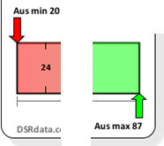
Broken context rulers
Sometimes the context ruler may appear broken towards one end like the following example.
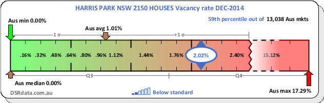
The maximum vacancy rate for this month was 17.29%. But the average, median and this market's vacancy rate are all around 2% or lower. This is less than one eighth of the total width of the ruler. That means all the key stats would be bunched up to the left side of the ruler.
So in cases like this, we break the scale on the ruler and stretch out all the important stats so they occupy more of the ruler. Then we show the jagged edge and a dotted line to make it clear, the ruler's scale has been broken.
No green-red shading
A market with a high typical value is no better or worse than one that is low in terms of potential for capital growth. So the ruler is not shaded red or green in this case.