Suburb Analyser
How many times have you heard a developer, cab driver or so-called property expert say, "This is a hot spot"?
See if they're in the ballpark or full of B.S. using the 'Suburb Analyser'.
What is the Suburb Analyser?
The Suburb Anaylser enables you to look up the most comprehensive set of supply and demand indicators available for any property market in Australia. Some of these stats are available nowhere else except here at DSR data. You can use these to intimately understand the nature of supply and demand for any Australian property market.
Show me now
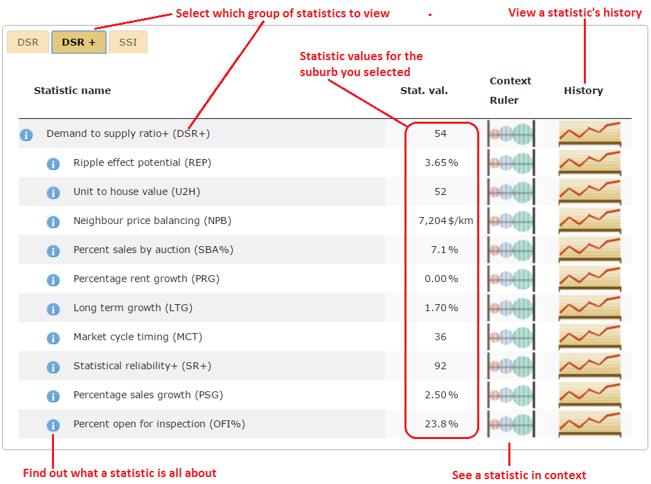
The following image is a screen shot of the Suburb Analyser with the DSR+ tab selected. The red markings point out the features of the Suburb Analyser.

Supply and demand are the only factors affecting price growth. So the Suburb Analyser is your first-stop-shop whenever a pesky developer recommends, "Invest here - you can't go wrong"!
If you're ever nervous about an investment or not sure if the location is right, make sure you check it out in the Suburb Analyser. It gives the most comprehensive view of supply and demand data for almost any property market in Australia.
What's in the Suburb Analyser?
Statistics displayed in the Suburb Analyser are split into 3 groups:
- DSR is the Demand to Supply Ratio and all its statistics as seen in property mags for years
- DSR+ is the 'souped up' version that includes loads more fresh data
- SSI is the list of Strategy Suitability Indices
Can anyone use the Suburb Analyser?
Anyone who has at least a paid membership with DSRdata.com.au can use the Suburb Analyser. Note however, that DSR+ and SSI stats are only for "Pro" members. The default membership after registering does not cost anything but does not provide access to any data. A Light member can access all the statistics in the DSR group, but no data in the DSR+ or SSI groups.
It's easy to upgrade to Light or Pro, but it does cost. See pricing for details.
How do I use the Suburb Analyser?
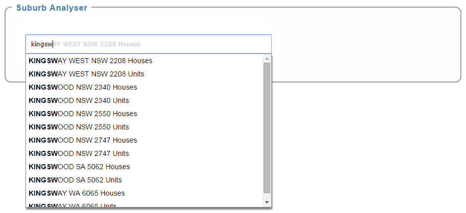
Simply start typing the name of a suburb you're interested in and a list of matching markets will appear.

Note that the markets are split in two:
- Houses
- Units
You can check out both markets in the one suburb to see if one is better. Always be sure you select the right property type when researching since the demand and supply for one can differ significantly in the same suburb.
Examine the statistics on the tabs that you have access to (DSR, DSR+ & SSI). Hover your mouse over the information icon to see what each statistic is.
If that isn't enough, you can click on the "more" link and go to a page dedicated to thoroughly explaining that statistic.
How do I know if a statistic is good?
Everyone knows that a vacancy rate under 1% is pretty good. But do you know what a good value for Neighbour Price Balancing (NPB) is? What about a score for Market Cycle Timing (MCT)?
This is where a graphic to display a statistic's value in context with the national average would come in handy. Click on the Context Ruler button to the right of the statistic's value.
Clicking this button will pop-up a graphic looking something like this?

This is called a Context Ruler. It places an unfamiliar statistic in perspective visually.
How can I see values from the past?
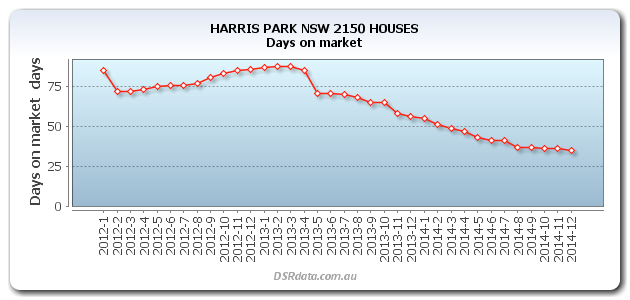
Click on the next button in the Suburb Analyser to see a statistic's history.
This button will display a chart of historical values for the statistic.
