Supply and demand in our capitals
| Topics: | Brisbane, Sydney, Supply and demand, DSR-Demand to supply ratio |
| Author: | Jeremy Sheppard |
| Date: | 27th April 2015 |
Towards the end of 2014 some commentators said Brisbane's year would be 2015. Is it playing out that way? Is Adelaide about to shine or is there some other surprise? Sydney has had a great run for the last couple of years. Is it running out of puff? If so, which city is next?
I usually don't jump into debates about future price growth at a macro level, like cities or states. This is because as an investor I can only buy one property in one street of one suburb of one post code of one local government area in one region of a city. So the macro data at city level is less important to me than the micro data at suburb level.
But given the amount of noise I've heard recently about which city is next after Sydney and the number of people who keep asking me, I thought I better do some research and have an answer ready.
Demand to supply ratio (DSR)
Since supply and demand are the only forces affecting price change, I thought I'd examine the average Demand to Supply Ratio (DSR) for all suburbs within each of our state's capitals.
The DSR is a score out of 100 for the ratio of demand to supply. A score of 50 is a market theoretically in balance and probably going to experience growth at about the same rate as the long term national average.
Any DSR above 70 is a market with considerable pressure on prices to rise. A DSR of less than 40 is a property market you should be very cautious of since prices may actually decline.
I decided to plot the DSR over the last three years to see if the chart would reveal anything of interest.
Let's start with an examination of the DSR chart for the big four: Sydney, Melbourne, Brisbane and Perth.
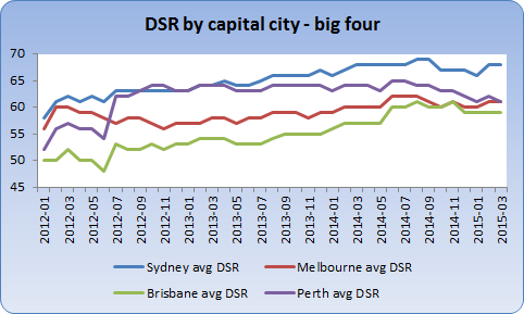
Sydney
As you can see from the chart, Sydney is still leading the way in terms of demand exceeding supply. For the end of March the average DSR was 68.
You can see that the DSR has been steadily rising for the last few years. But it looks like the imbalance between supply and demand isn't about to get any worse since the DSR has levelled off.
This means the rate of growth in property prices in Sydney may already have been slowing. Perhaps Sydney's demand to supply ratio will be back in balance by 2016.
Melbourne
Melbourne had a pretty swift decline in DSR across 2012. But it started rising steadily throughout 2013. However, from the latter half of 2014 to date, there has not been a noticeable change. The DSR is above average, but not significantly at 61 as at the end of March 2015.
This means price growth in Melbourne is likely to continue much as it has for the last year - bit of this and that, but nothing to write home about.
Brisbane
Some commentators were picking Brisbane to be the next growth market even as early as the end of 2013. But of course nothing much happened. So they rolled their predictions into 2014. Again nothing happened, so they rolled their predictions into 2015.
The latest issue of Your Investment Property magazine (issue 94 May 2015) has a section called State Roundup. For the state roundup for QLD they quote PRD Nationwide's national research manager Diaswati Mardiasmo who says, "Brisbane is growing at a high rate, and since prices have no yet reached their near peak like Sydney, 2015 will be hotter than ever".
In the same section they quote Cameron Kusher of Core Logic RP Data, "Of all the major capitals, Brisbane appears to be showing the strongest fundamentals".
However, it was only towards the end of 2014 that the DSR rose to a figure in the high 50s. And it looks like it has levelled off there finishing March with a DSR of 59.
The DSR for Brisbane is still lower than all the other major capitals except for Darwin on 58. (We'll get to those charts in a minute).
What this means is that even 2015 is unlikely to be the year for Brisbane sorry.
Perth
From mid-2012 to mid-2013 Perth has matched Sydney in terms of DSR. However, that all changed in the middle of 2013 when the resources boom had turned to gloom and property development caught up with demand. Around the same time, Sydney started to take off.
From the middle of 2014 to date, there has been a clear downward trend in the DSR for Perth. Perth has had some good growth over recent years. The return to balance of the DSR is a clear indicator that the city's price growth is slowing.
Chart 2 - The little four
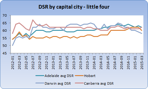
Adelaide
Adelaide had a DSR hovering around the 60 mark for quite some time up until early 2014. Then demand seemed to increase or supply was reduced for almost a year. But the last few months are showing that Adelaide may not have the high surge in prices we expected. But it should at least be one of the better performers finishing March with a DSR of 62.
Hobart
Most investors who follow the commentary about Tasmania from economists would have heard almost nothing positive about Hobart for many years. But over 2014 the DSR has been rising strongly.
However, there was a lot of ground for Hobart to catch up. Finishing March 2015 with a score of 60, shows that Hobart should experience some reasonable capital growth. 60 is nothing flash, but it is better than the mid-50s it has been hovering around for a long while.
Darwin
There's no doubt Darwin's property market is weakening. The DSR has dropped from the mid-60s less than a year ago down to 58 as at the end of March. This is the lowest score out of all the major capitals. But it is far from a disaster.
Darwin's growth in the short term will be limited and possibly negligible. Hopefully the sharp descent in the DSR recently will level out.
Canberra
Despite how small the Canberra market is, the DSR has shown the most consistency compared to the other capitals apart from an extremely volatile time in mid-2012.
The DSR ended March 2015 on par with Adelaide at 62. That's a bit of a surprise given the negative commentary and a belief there is over-supply. Watch this market.
Conclusion
The following chart shows there is really only one city to still talk about (as if that's relevant).
And that city is not Brisbane, it is still Sydney.
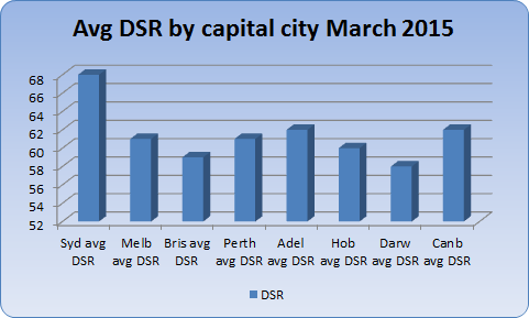
What happens next is not entirely known. But both Adelaide and Canberra should experience capital growth above that of Brisbane and Darwin for at least the next 6 months according to the DSR.
Just for completeness I thought I'd see if the
DSR+
gave any further insight.
The DSR+ is more accurate than the DSR since it considers more data, 17 statistics versus only 8 for the basic DSR.
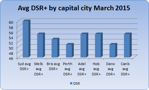
As you can see there is not much difference in the overall conclusion between DSR and DSR+.
Sydney is still far and away the best market to invest in right now despite the recent rise in prices.
We'll know in a little less than a year whether the DSR was right about Brisbane or whether PRD Nationwide and Core Logic RP Data were right. We can safely say that if Sydney outperforms Brisbane over that time frame, then the DSR was right and they were wrong.
Warning
Note that there will be winners and losers in every capital city. The average growth of the city may rise, but an investor may pick an individual suburb that falls. Data at the micro level of a suburb will be of much more use to investors than this rather theoretical mouthing about the future growth of our cities.
That means investors can find great opportunities in just about every city and make bad decisions in just about every city too.
From here: